NatSnak

BRANDING
PACKAGING DESIGN
TOOLS:
Procreate
Illustrator
Photoshop
NatSnak
This was an A-Z project to collaboratively conceive, design and launch a mid-priced dried fruit & nuts brand. The client already owned Premium Harvest, a higher priced range of similar products, and were looking to create a more fun and approachable “snackable” sub-brand.
This project included the naming, branding, and packaging of this product, as well as the copywriting of each product’s description.
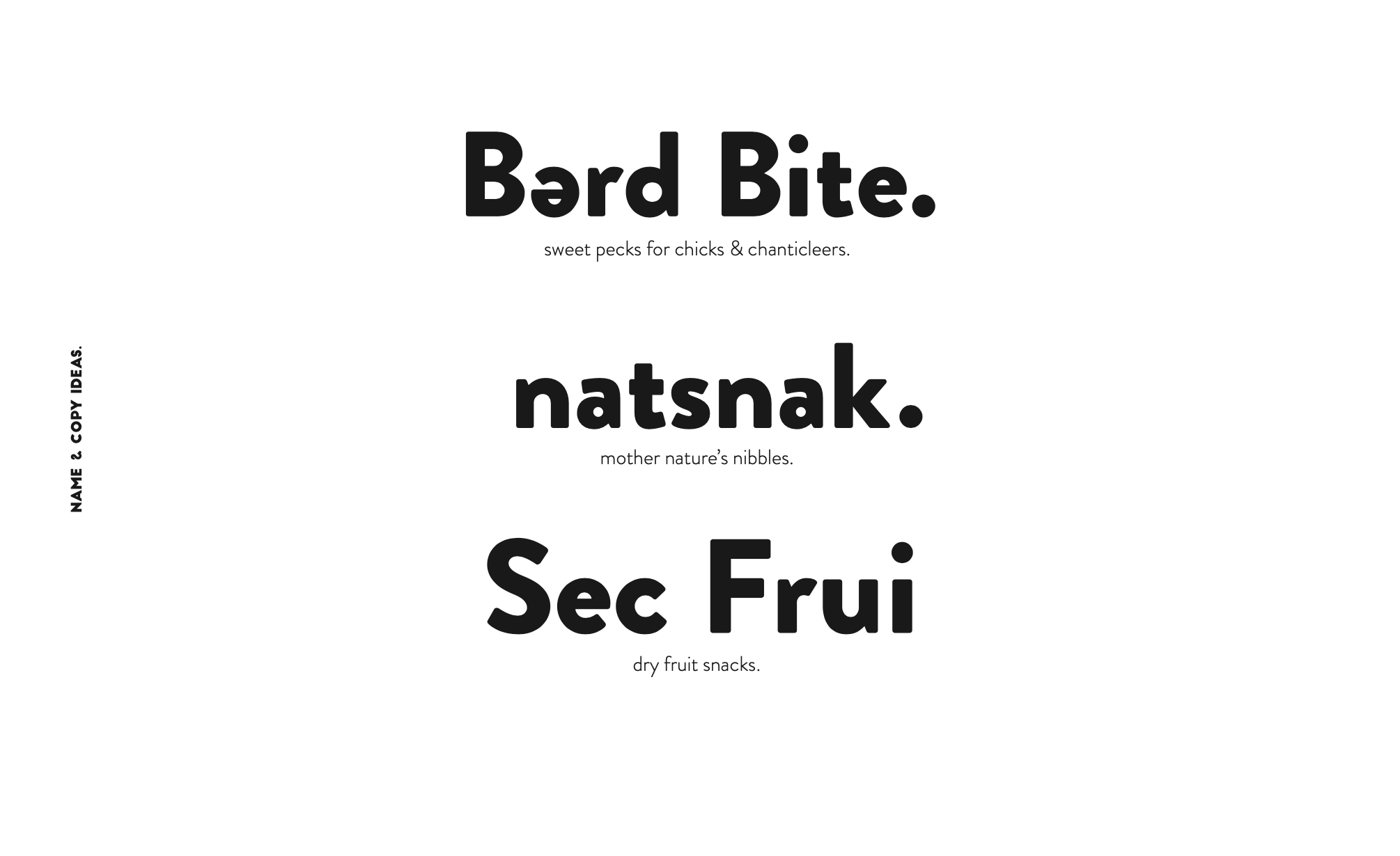
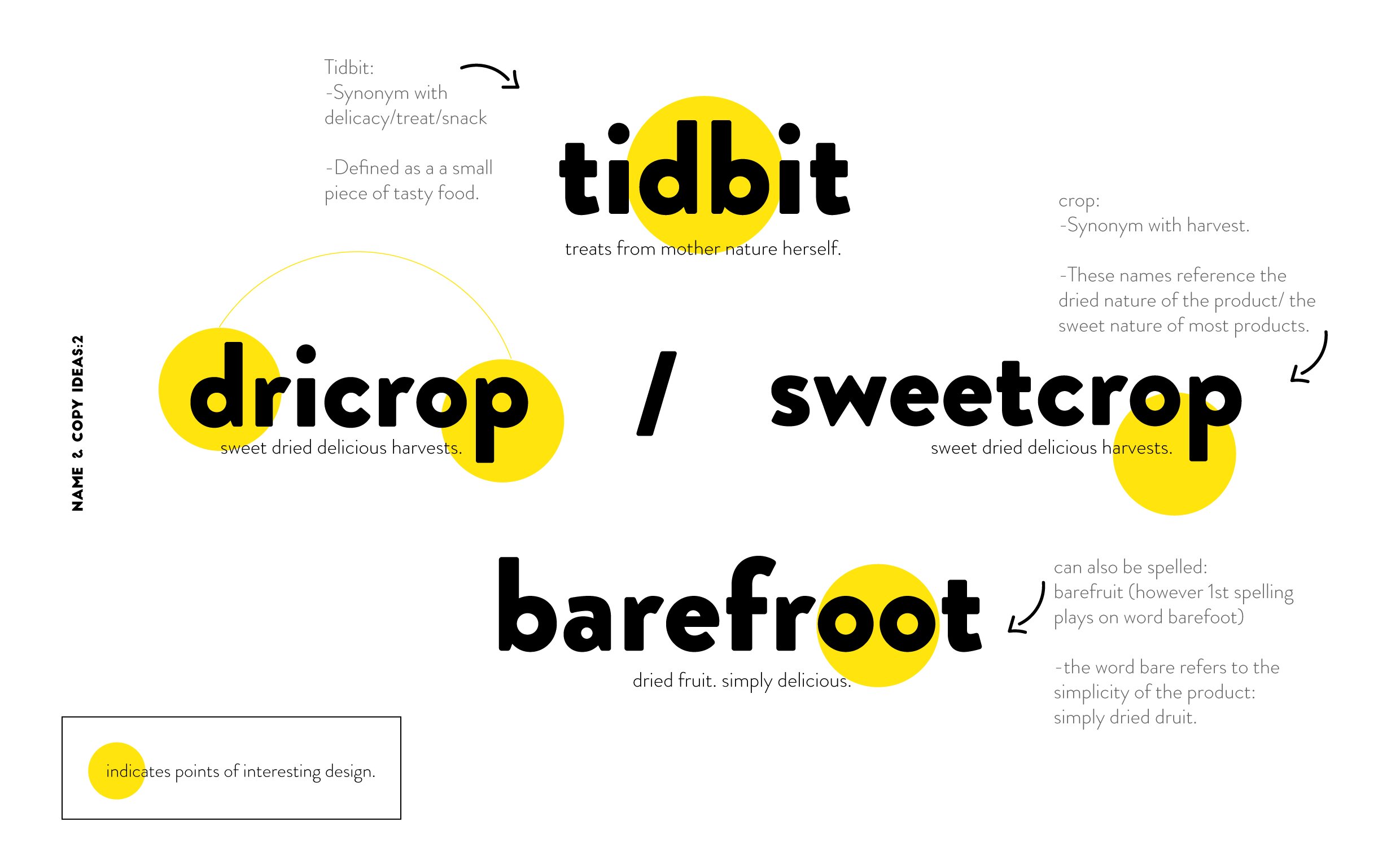
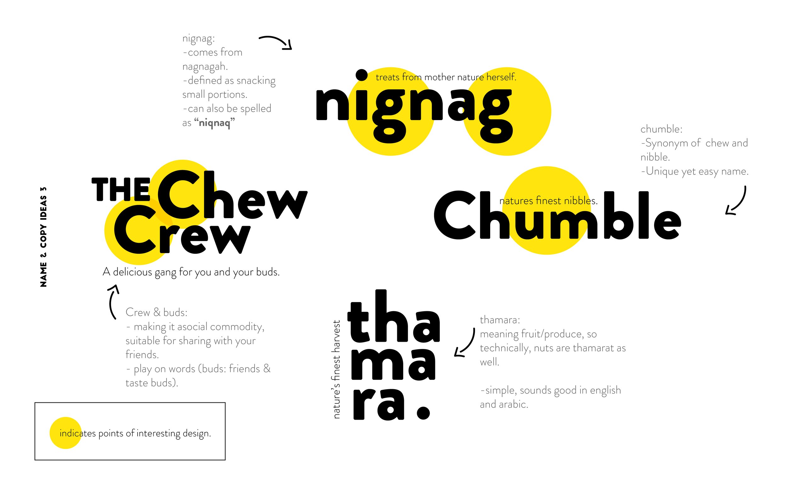
The final name, NatSnak came from abbreviating “Natural Snack”, in an attempt to create a catchy name that rolls off the tongue when looking for at a grocery store.
Branding
After picking the name, the branding process started with offering a variety of mood boards, from which the client chooses one. The logo design was inspired from the chosen mood board, I then created three sketches for a logo, from which I chose this hand lettered one this to vectorize.
Packaging
The requirements for the packaging design were to create a set of 10 flavors, to ensure a clear section to show a glimpse of the product, and to use an image of the the un-dried fruit to give a sense of freshness.
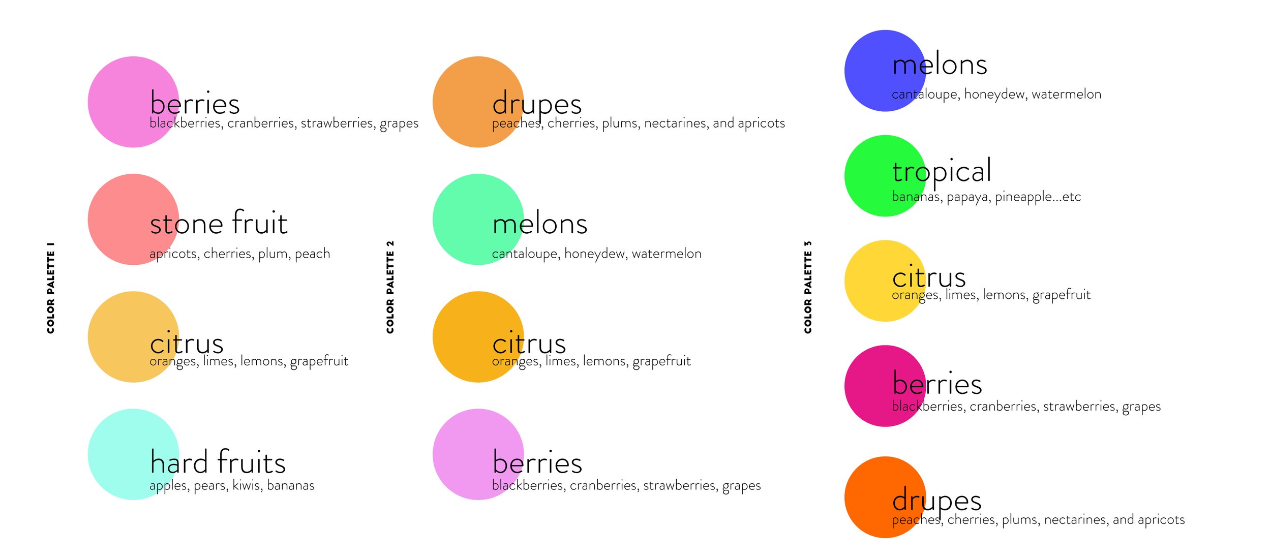
Each flavor is given a color combination. The images are chosen and edited to complement the color scheme. The back of the packages include a unique paragraph tailored for each fruit.


