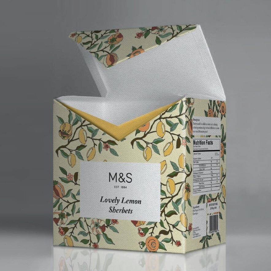
M&S Sweets Packaging
Packaging design for a range of candies by Marks & Spencer

SUB-BRAND DESIGN
PACKAGING DESIGN
TOOLS
Pen & Paper
Adobe Illustrator
Photoshop

Marks & Spencer’s Sweets Packaging
The goal was to brand and package a range of M&S Candies: three flavors that are otherwise commonly child-oriented.
Taking the brand's audience in mind, mostly middle class British adults, I took inspiration from Fortnum & Mason Chocolatier as well as prints by reknown textile designer William Morris. Given the target audience, I decided to package the candies in a stiff geometric form as many of Marks & Spencer’s more upscale food products are packaged in boxes or cylinders, instead of plastic bags.
Color and Pattern
Both the color palette and the illustrated pattern were thus taken from these inspirations, and given an updated look. The structure was kept simple not to distract from the intricate pattern.
Interaction
The interaction comes in the form of an "adult coloring book" inspired backside, with the same pattern in black & white, which invites the consumer to fill it in for fun or to relieve stress.


Design Development

I began by tracing a few William Morris illustrations, adapting them to add the fruits that are relevant to the flavors of the candies. I then created a custom palette, updating the faded palette but keeping it sophisticated with muted tones and trending pastels.
The initial concept was for the packaging to be made out of semi-transparent material, with the colorful candies coming through and almost painting the outlined illustrations. But after a few iterations with different materials, I decided to go with watercolor card stock, which allows the consumer to color in the back of the packaging with whatever medium they prefer.

