

BRANDING | PRODUCT DESIGN
TOOLS
Photoshop
Illustrator
3D Max
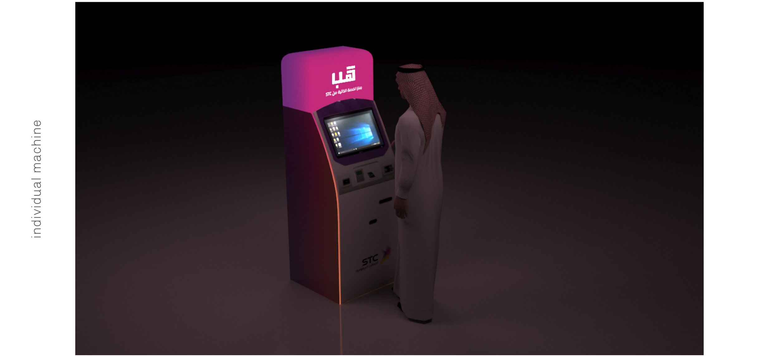
Hub: STC Self service machine
During my time at J. Walter Thompson, I was asked to come up with the branding and product concept for the Saudi Telecom Company’s first Self Service Machine.
The Machine acts like a hub, completely independent to the store yet fully functioning as one, enabling the user to access almost 100% of possible services of store locations.
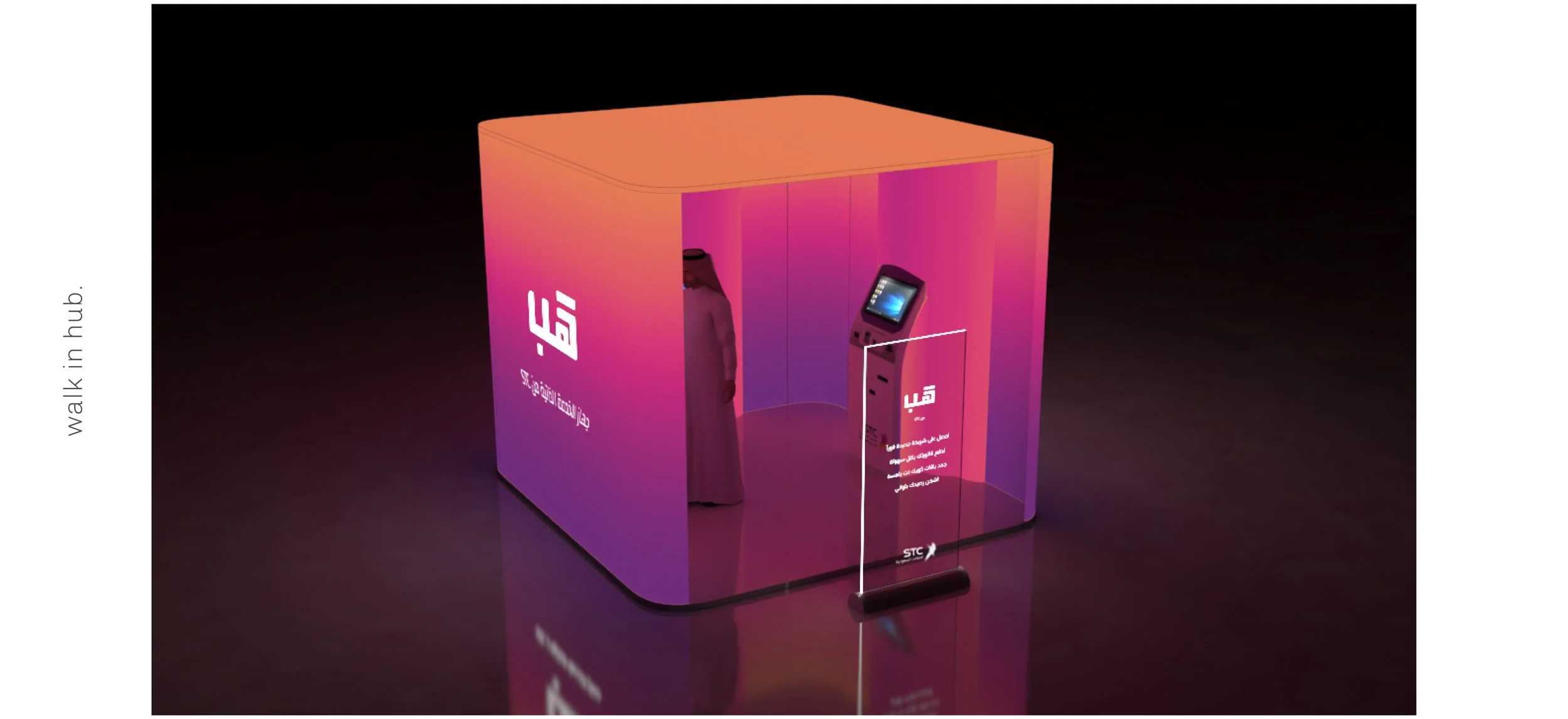
The resulting concept, after multiple rounds of ideation, was The Hub: a sleek design that used the company’s famous gradient* in a way that was never used before, introducing a futuristic feel so their existing brand identity.
*the gradient was a prominent feature of STC’s old branding, before their 2020 rebrand.

Goal
These self service machines are meant to be functioning 24/7, placed all over the city, inside malls as well as out on the streets. These actual machines are already designed and produced, and STC was looking to “rebrand” them without changing the physical design of the outdated machine. Given that they are essentially functioning all inclusive self service stores 24 hours a day , the light box installations are meant to be seen as identifiable pillars throughout the night.
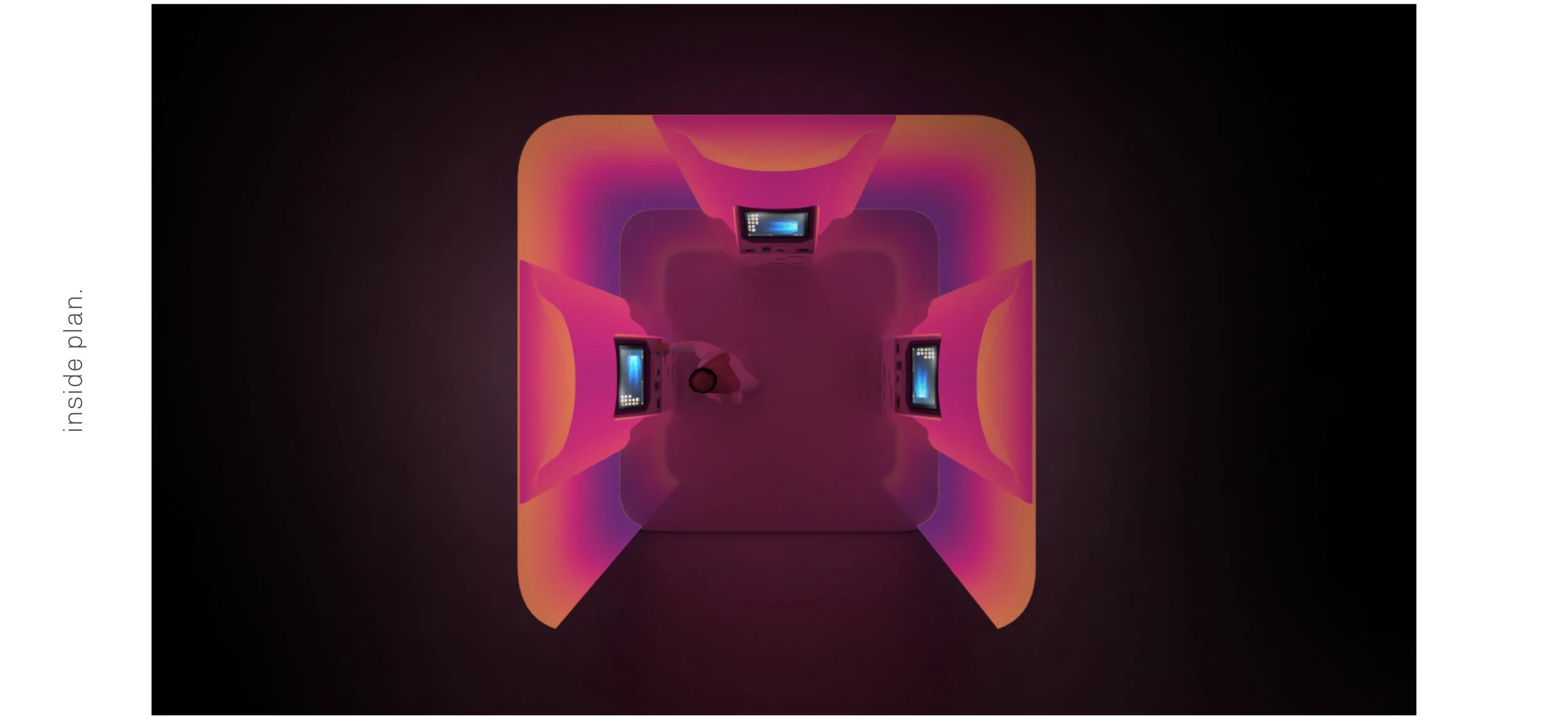
Three designs were proposed, one for a singular machine, and two for a cluster of multiple machines. The concept was to create an interactive light installation with a moving gradient that reacts to a user’s touch. However, this technology was not within the budget and the implementation was reduced to a simple light box with automatic moving gradient.
Audience
This rebrand was meant to be the start of a DIY movement, that was meant to push STC’s entire consumer base towards a more digital interaction with the company’s services. It later became part of a campaign that won a regional Lynx award.

The name was later changed from HUB to SHOP and the brand identity was expanded upon.
